Showing posts with label Tutorial Feedback. Show all posts


The mid-section is confusing; a lot of the action is missing. You are meant to make sense of what is going in a pre-viz so it’s best to put a bit more information to make sure it reads better. Make the pre-vis more functional and don’t worry too much about posing the characters.

By moving the characters slightly, for instance by using a simple spin to indicate dancing, will help with figuring out the timing and will make the story clearer. Also, simple sound effects like the rustling of the bushes will help to read the pre-vis better.

The animation will have to shrink down to about 3:30 minutes (not including credits). Possibly think of removing any repetitive scenes or cutting from the long introduction scene and add it up to the dance sequence. It’s hard to judge if the dance sequence is enough or not at the moment so it’s best to take reference from the Thai Dance Academy footage and practice so key poses.

The ground needs to be more graphically enhanced. Add more rocks for instance, leaves or even more vegetation to fill the emptiness. More props will fake the distance even more. Consider adding foreground elements like tree branches or leaves hanging from the side.

The characters (or the focal point of the shot) have to be framed into the scene. This will be achieved by placing the props around them, (or the around flower in the opening scene’s case) to lead the viewer’s eyes to them. As opposed to placing props randomly, think of the composition as a frame to make the characters stand out and direct the viewer to them. Also think of symmetry when placing objects around depending on what the center of attention is. For example, there is a scene in the Pre-vis where Kinnaree and Hemmy are both in the middle of the shot and there is a tree on the side. Maybe add an extra tree on the other side to make a frame around them.

We need to push ourselves even more into animation since the whole project was based that and we haven’t shown much of it so far.

Tutorial feedback 29/01/2013


An exercise that all professional animators (Disney, Pixar) do and help get to the head of a character is working on a pose and an expression a day. That exercise will help with getting used to posing the character by starting with quick thumbnail drawings. 

For the expressions, a good start for Hemmy will be to look into human faces and gradually move to animal ones. The drawings will help to get a good idea of squash and stretch on the characters’ faces and what sort of controls will have to be added in order for the drawings to correspond to the digital version.
For the body, it’s important to get good arcs (spine curvatures), especially for the dance sequence. That will build a good foundation artistically for the animation period. 

Examples of expression sheets and poses


We shouldn't take the muscle system too far but stick to more simple pose deformers to switch our concentration to animating . People will forgive a bit folding on the geometry but will not forgive poor animation. LOOK AT THE OVERALL PICTURE; DON’T WASTE TIME ON UNNECESSARY TWEAKING. 

Two computers in the red room will have the Pose Deformer plug-in installed for us to use it for any skinning issues with the body and enable better squash and stretch on the face and body. Squash and stretch will be more necessary for Hemmy as a sidekick, more humorous character as opposed to Kinnaree who is a more human, elegant creature. 

The facial animation will work with sculpted blendshapes but also clusters on the top for more control of the facial features and expressions. It’s best to have the head separate from the rest of the mesh for easier blendshape control. 

Grab some generic characters to start practising animation. Or even work on just curves and arcs which is central to the character and work our way outwards by moving to the body and then the limbs and the face. Once we get the root animation right then it will be easier to work with the rest of the body. Practice posing will help in what pose we want to get into and make animation more understandable to us. Work with layers when using root animation and use low-res geometry to make life easier. 

Even to work on our Pre-Viz, we will have to practice our posing from this very early stage of refining the characters. Put together reference sheets for emotions, not just the generic sad and happiness but also the in-between, less obvious emotions. That communication level is vital for an animator but also for an actor. World known actors think how to make things via their character but they still have to communicate and find a way to do it in a reduced manner. When thinking of Kinnaree her emotions will be a combined graceful-happy, graceful-sad. With Hemmy it’s playful-happy, playfull-sad. These emotions will take time to depict. 

While refining the characters for animation we might find that we’ll have to work with limitations as the characters might not be able to do any extreme posing. Sometimes restriction is good; it makes you figure it out. 

Look up the Book : Dynamic Drawing. 

Include strands to our week to week schedule to merge the animation practice process with the character refinements of the first two weeks. This will run through the whole projects. 

Side schedule strands for the next two weeks: Set up, Posing and expression practice 

Look into the shaders to work out the complexity and reduce rendering time. 

Use Alan’s tutorial to reduce the size of the maps -> less rendering time 

Use material x for mental ray. 

Mipmap tends to work better.

In terms of use of leaves/ flowers/ blossoms they’re all helping the feeling of being in this ethereal atmosphere, invited into this mystical world. In the animatic change the flowers into leaves. Augmenting all the shots all the time with what it looks like, although in terms of proportionately we need more time with them dancing. We can probably truncate the beginning and manage the ending.

Resolve the slowly, secretive little coy scenes and look at how to weight the piece so that the ending is not rushed. Look at a few more sketches to slot into the animatic. Look at Hemaraj/ how it as a puppy is silly knocking things over, sitting on a plant; an actual incident to introduce his arrival. He needs to be more annoying and disruptive just by being there. Kinnaree will do something lovely and he will happens to that something and being proactive at mucking it up.

The animation “…the cat came back the very next day”. The numbers involved is a case where the relationship builds through a few incidents, great example of how to operate the sequences in our animatic. Hemaraj-annoyance boost; Kinnaree is coming off as a moody brat at the moment. In act 2 we need a bit of escalation so we can feel her frustration just a bit more as opposed to she’s a bit anti-social. The focus pulling in the animatic; the parallax is working, but more comedy. Not as sort of “Ren and Stimpy”, we need to build in some more time. We need gags in this act.


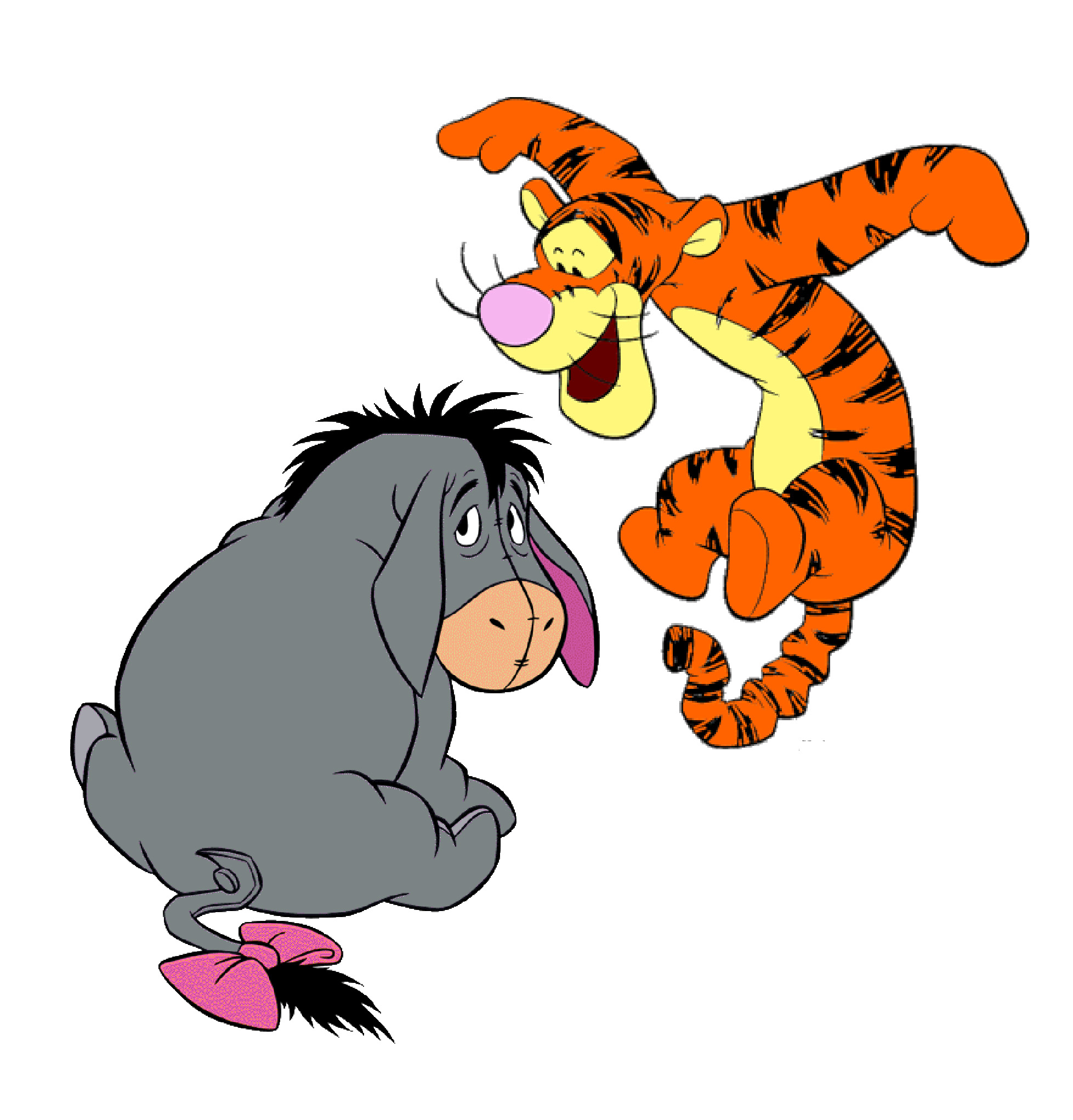
Hemaraj – the character archetype needs to be more doggish than dragonish. Look at Tigger in Winnie-the-Pooh. He is an irrepressible, bouncy, cute thing.

Kinnaree - Something imperious is already coming off of her persona in the animatic which is good, but needs a push – need to remove the moody cow element.
Enamelling design – surface jewellery patterns to be applied to the props and elements in our world. Mirror cracks and on the black of the glass, the silver paint; the deeper the mirror, the more rich the reflection is somehow. Large, old mirrors; the quality of their flatness where you can swim in it, you end up with the sense of thickness, over a colour reflective surface.  

Study the SSS shader in Maya; how to create a lustre quality with the enamel in mirrors, the throw of light. Is there a way for our flat planes in Maya to investigate ways in how the SSS shader/ route in hypershade for the colours to glow, not in a liquidly way, but as if the light is going in the top surface and bouncing off of the back surface. So, we can have a laminated surface; silver back surface, a layer of gold resin, and on top of that layer of resin, a colour of green. This will make a vanished effect; a bejeweled  pearlescent look. Light will skim across the surface and make the object come alive with a coating of reflection and a scattering of colour punching through. We want a burnished feel, a mellow light scattering across the planes/ displacement geometry in Maya. A depth of colour is happening on a flat, 2D plane. It’s all about layering. A composite effect as it bounces back on or eye.
Our world begins as if in the morning, a sense of wintry dew on the trees and the antique sun working through the environment. As we continue to unveil the bits of the world through the camera, we should feel vibes of passive neutrality. Something feels decorative, jewellery like. Details and pigments like “The Dark Crystal (1982)”. A shimmer of iridescence will be working off of the planes; the pieces of jewellery.
To summarise, we need escalation in act 2 to remove the unsympathetic element from Kinnaree, a few of annoyance scenes, plus the gags. The frustration will arise in the audience to, as opposed to being something charming. Also, we need a couple more of increments and a longer ending where the two characters are dancing in unison. 


Yesterday's tutorial was a reality check for the art direction we are aiming for in our animation. Dayle's thumbnail drawings are heading towards the right direction but need to become even bolder with more emphasized  Thai elements on them.
The trick to make this work is to strip whatever is unnecessary and  rely on a limited amount of colours and patterns. Our world has to become minimalistic with the use of patterns and negative space to give the illusion of an open space. We are specifically looking into three animated films which we find inspiring:  Thomas Beale Cipher, The Silence beneath the Bark and The Secret of Kells. 

Notes after Feedback

• Decorative – None of that
• Character Design Silhouettes
• Not to use alchemy when producing silhouettes.
• Kinnaree should not be imperial; ambiguous; intimidating
• Kinnaree should be brattish, charming, look at padmay from Star Wars – Natalie Portman
• Cultururally the piece should not derive from a type of witchiness
• It is more allufe, fey, anti-witchy quality
• Archetypes of imperial women
• Girl playing queen
• Irrelevant comparisons based on vague perceptions
• Music: Zakk, YouTube composer signature theme ost of a certain character; two bits of music co-habit/ Harmony
• Instructions on themes; based on characteristics
• Kinnaree – Pecky
• Hemaraj – Percussion
• Musical information/ way to commission/ if music is unusable, critically construct why it doesn’t/ creative wriggle room/ Bird-like ethnicity/ identity with a track on YouTube
• Look at Peter & the Wolf
• Thumbnails/ Art Direction
• Emulate Thai/ Logic: shapes derived from Thai ethnicity/ absolute Thailand
• Secret of Kells: Celtic Carvings.
• Kinnaree: Thailand fabrics/ murals/ silks
• Bolder representation of Thai
• Tracing back to Thai ethnicity
• Relationship colour with distilled, evocative of Thai culture/ Limitation of look at Kuler
• 5 words of boundaries = more coherent world
• Task: Thai ceremonial fabrics/ silks/ patterns to be extracted
• Colour limitation/ gradients/ enamel/ gold pastiche
• Look at Thomas Beale Cipher
• Back to drawing board with specific look at influence maps
• Limiting colours: Jade green, gold…
• Negative space patterns
• White signifies death in Thai culture
• Kinnaree oriental white shadows/ gold shadows
• Getting the right recipe in the concepts
• A lighting rig set-up in service to the style we will establish/ with 2D elements
• Limited/ linear/ striped away
• Indie scenes
• Honing understanding/ re-configure the world pieces. At present, the environmental thumbnails look reminiscent of rain forests – generic space - thus have no belonging to a Thai world. It does not invoke core visual Thai themes. Generic fantasy
• Visuals need to SCREAM Thailand! They will not work otherwise
• Lightblubs from Kells references need turning off
• Sown/ embroidered Thai designs
• Harry Potter animation: Tale of the Three Brothers
• Inverted shadows
• Audaciousness/ sustained colour palette – aforementioned Harry Potter: Tale of the Three Brothers
• Turn off seventy-five percent of current light bulbs
• Limitation; work with unique budget
• Five colours; seven surface patterns
• Sky colour
• Shadow colour
• Floral colour
• Rock colour
• What is our Thailand?
• 16:9
• Preceding character models to be used in testing to look at how 2D and 3D can be combined
• Coherence!
• Say no to generic content
• Thailand-ish ingredients needed for a highly spiced dish of visual ecstasy
• The Silence Beneath the Bark – by Joanna Lurie
• Character Design in service of the world/ essentialised it is
• Cultural precision
• Thomas – Avant-Garde
• Definitive Map/ Essential Oil/ Potency
• Hillscape
• Style wins


Analysing works

Thomas Beale Cipher – Stability of the projected patterns. Patterns do not move. Collaged-based; pattern shadows, negative space


The Silence beneath the Bark by Joanna Lurie – Composited After-effects sandwich/ Negative space; patterned shadows against the inverted whiteness of the forest floor


Secret of Kells – Patterns are strongly influenced by originating text/ cultural references/ everything is patterned, no negative space


Lai Thai Art