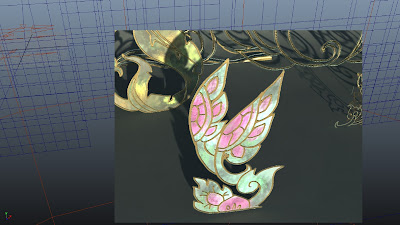
This is my progress so far on the environment. I am going to concentrate on my character from now on and get back to this after Christmas, hopefully. The next step with that will be to 'build' the forest and the surrounding matte paintings to avoid making it look so stage-like. Also work on the Z-depth to the environment the sense of depth.
Production: Environment Props Progression
Posted by Andriana Laskari at 17:12 Labels: Environment, Production
Hello and welcome to MM studios. We're a CG Arts & Animation duo with a positive attitude and persevering determination.
Here you'll be able to follow the journey as we participate in creating a 3d animation for our self-initiated Project (Minor and Major). This will be based on Thai mythology; the 'Kinnaree'.
To find out more click here.
The third stage of the course at the University of the Creative Arts (UCA) in Rochester.
Members
Labels
- 1st Assessment Checklist
- 2013
- After Effects
- Animatic
- Animation
- Animation Reference
- Art Direction
- Branding
- Character
- Compositing Production
- Concept Art
- Dope sheet
- Editing
- Environment
- Exposure sheet
- Hemaraj
- Influence Maps
- Interim Crit Presentation
- Kinnaree
- Major Project
- Mango Mercury
- Marketing
- Maya
- Microsoft Excel
- Minor Project
- Modelling
- Mudbox
- New Designers
- Other
- Post Hand in Work
- Post-prorduction
- Pre-production
- PreVis
- Problem Solving
- Production
- Project Brief
- Promotion
- Proposals
- Quadruped Animation
- Research
- Rigging
- Script
- Skinning
- Skwigly Online animation magazine
- Spungella
- Storyboards
- Submission
- Texturing
- Thumbnails
- Timetable
- turnaround
- Tutorial Feedback
- work-in-progress
Followers
Powered by WordPress
©
Mango Mercury, by Dayle Sanders and Andriana Laskari.
.
.


These are looking very promising, Andi - and something else for you and Dayle to think about - the floor plane? For example if you were to build in a slight camber or rise to the floor plane, then this too will add additional three dimensionality and 'aliveness' to your world - it means the environment assets won't all just sit on the same axis, but will have rise and fall. I'm not talking a huge exaggeration of rise and fall, obviously, but rather a soft undulation. Of course, you also need to figure out how to texture/colour the floor plane too. I'd suggest committing to these elements - the floor, the cyclorama etc - and combining them with your props - will very soon reveal the necessary style tweaks, but also reassure you that your world is indeed going to gel :)
ReplyDeleteI see what you mean there Phil. You sort of explained it to me the other day. At the moment it obviously feels a bit too bare, like the props are too staged. But certainly some small 'rises' of the ground plane will definitely help to make it look more organic.Also matte paintings on the background will help. It's getting there..slowly.
ReplyDeleteCheers for that :)